Expert’s Thoughts

"Most users are on mobile today. It is convenient and highly accessible, while searching, talking, writing, scrolling and working on mobile have become an integral part of our lives. What does it mean for business? Only the fact that the mobile market long ago became one of the most vital sources of companies positioning and services promotion. This fact means that special attention should be paid to attractive, functional and user-friendly mobile web design. Silk Data prepared this blogpost to make you familiar with ‘mobile-first’ design approach, show you how to efficiently link strong sides of website and mobile and give you several tips on how to properly work with web design of mobile applications."
Yuri Svirid, PhD. — CEO Silk Data
Market Insights
Let’s start with the statistics that should always be considered by anyone who wants to stay competitive in 2025.
At the end of 2024, mobile devices generated more than 62% of global website traffic (Statista).

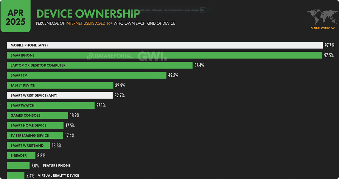
In April 2025 almost 98% of adult Internet users own mobile phones, and even PCs and laptops are far behind (DataReportal).
In June 2024 88% of online users said that they won’t return to a site after a bad user experience (Forbes).
- 74% of online users said that they will certainly return to a website that is mobile-friendly (Forbes).
In other words, if your product isn’t optimized for a 6-inch screen, you’re not just risking a bad impression. You’re pushing your potential customers away, helping your competitors prosper.
But mobile-first design isn’t just about shrinking things down. It’s about rethinking how people interact with content when they’re holding a mobile device, tapping with thumbs, juggling distractions and expecting instant results.
Through that, Silk Data prepared the following blogpost on web and mobile development, considering the approach when the mobile version, being prior, influences product design.
What Mobile-First Actually Means
The first thing that you should realize is that mobile-first doesn’t mean "mobile-only." It is a design approach or even a philosophy, where products are created for smartphones before adapting them to larger screens (tablets, desktops). In other words, it means starting the design and product (website or web app) development process assuming the user is on a mobile device and then adding features and layout complexity, as the screen size increases.
This approach is grounded in a technical methodology called progressive enhancement . The essence of the methodology is that you build the core experience for mobile, then layer features, layouts and visual complexity for tablets and desktops.
The Benefits of Mobile-First Design
One more thing that you must realize is that the above-mentioned approach is not another modern technique developed to make the world of IT and commercial development even more complicated. Actually, the approach was invented in 2011 in response to the growing popularity and technological capabilities of mobile phones and as a counterpart to the old ‘desktop-first’ approach that started to lose its relevance.
Through that, mobile-first can provide several advantages, and their importance grows every single month.

Larger Audience Reach
By prioritizing mobile devices, you cater to the majority of users. With almost 2/3 of all web traffic coming from smartphones, mobile-first ensures your product is usable and appealing to the largest audience and largest possible customer segment.

Higher Conversion Rates
Mobile-first forces simplicity. Following the ‘mobile-first’ approach, you may reduce friction in the user journey, making it easier for them to interact with your website or application. It is achieved through different ways:
- Focused content. Mobile screens demand prioritization, which means that only the most essential content and features make the cut. For example, McKinsey review of 2023 proved that 71% of users expect personalized interactions from the company's products.
- Faster load times. With mobile-first design, you inherently optimize performance and provide quicker access to your content. According to Forbes study of 2024, 47% of users won’t wait longer than two seconds for a website to load.
- Simplified interface. Small screens imply that the functionality and its display on the device should be as space-saving and well-structured as possible. Simple CTAs, one-tap actions and simplified navigation have become a priority. A good example is Amazon, who prioritizes a single "Buy Now" button over complex menus.

Enhanced Scalability
The principle is simple - it is easier to adapt design from smaller screens to larger than vice versa. You avoid the pitfalls of the ‘desktop-first’ approach, where shifting to mobile can break the whole layout. Moreover, the time of refactoring is reduced as well, as there’s no need to retroactively simplify desktop designs.
Apps like X (former Twitter) and Spotify are prominent examples of how originally mobile solutions could be easily and smoothly adapted to desktops.

Improved User Experience
There’s hardly a thing more vital and crucial for business’s promotion and positioning than pleasant UX. For example, the same Forbes report of June 2024 provides the following statistic data:
- More than 50% of users say that they use website design as a factor in formulating their opinion on a business.
- Users are 67% more likely to make a purchase if the website is mobile-friendly
- 57% of users won’t recommend a business with a poorly designed or unattractive website.
The situation forces the business to apply mobile-first, as this approach ensures that the user will be provided with the most convenient interface, relevant and most useful elements along with the fast time of loading.
Bonus Point (Can’t be Ignored). Since the rollout of mobile-first indexing, Google predominantly uses the mobile version of your site for ranking and indexing. If your mobile site is lacking, your SEO is already suffering. Even if you’ve nailed backlinks and domain authority, your organic visibility is at risk if your mobile experience is poor.
How to Implement Mobile-First Design: A Practical Guide
As we learned, designing mobile first is about building for the smallest screen, presenting the most important content and functionality first. If you get mobile-first design right, you’ll make everything else easier. Here’s how to do it.

Start with the Right Priorities
When developing a new web product today, starting with the desktop version is no longer the standard. Now, you have to begin any work, from initial requirements gathering to features and interface prototyping, with the mobile user in mind. This is the essence of mobile-first design - prioritizing the smallest screen and most constrained environment as the foundation for your digital experience.
The above-mentioned practice allows to put right priorities from the very first stages of the project, which becomes crucial in further perspective, as you will have less problems with adapting your perfectly tailored desktop website or application to a mobile version.

Understand Your Users and Their Devices
Instead of treating mobile as a constraint, treat it as a filter for clarity. You’ll be forced to answer:
1. Are most users visiting your product from mobile? (If not, perhaps, you should change the strategy and shift the focus).
2. What do they want to accomplish on their phones? (read something, find any information, purchase, etc.).
3. What frustrates them about mobile experiences? (inconvenient UI, irritating features, long loading periods, etc.).
The key here is to use analytical tools (e.g., Google Analytics) to check device usage and even run user surveys or interviews to find mobile-specific pain points. That is why your design and development teams should work in close cooperation with researchers and marketers, as it may relieve your business of the necessity to test multiple business and technical hypotheses.
However, even comprehensive market research doesn’t guarantee that the first idea will be a hundred percent effective. Every large project, whether it is related to AI development or mobile-first-focused website building, should get through the PoC process, when your business idea is tested on both technical and commercial possibility of its practical implementation.

Begin with the Mobile Layout
Once you get the data confirming the high importance of mobile users in your business’s positioning, the next step is to plan the layout specifically tailored for mobile devices. Here you come to wireframing.
Wireframes focus on structure, user flow and content hierarchy before visual styling of the mobile design. We discussed the necessity of wireframing and other types of prototyping in one of our blogposts on how to create a mobile application.
Design wireframing can be divided into three main levels:
- Low-fidelity wireframing. The most primitive level, where the attention is given to schematic representation of content structure, the whole website or app navigation, fields and rows positioning along with initial outlook. At this level, wireframes are nothing more than grey schemes, typically created with the help of tools like Balsamiq and Whimsical.
- Mid-fidelity wireframing. Next level that goes deeper into the layout building. Here you refine spacing between elements, typography and basic interactivity of the fields and separate elements. One of the most famous tools for creating design layouts at this level is Figma, which provides a great variety of templates and customization capabilities.
- Interactive prototyping. This is the most prominent level of design prototyping, as it focuses on imitation of user interaction and validation of design usability. It is performed with tools like Proto.io and Framer able to provide advanced animations and gestures and imitate code-like interactions (e.g., scroll-triggered effects).

Go to Design Development
At the previous stage we saw the approximate outlook and functioning of our product, so now it is time to get to the development itself. It also can be divided into several steps.
UI Building
This is the step where designers refine the prototype and prepare it for real development. The process may include a great variety of operations like optimizing all visual elements or setting the possible interface behavior . This is the step where all the preparations for development are made, and plain wireframes are turned into polished, pixel-perfect UIs while retaining mobile-first principles.
Frontend Development
One of the most complicated and time-consuming steps of design development, that also includes several sub-steps:
- Assets exporting. The initial sub-step, where the prepared UI is transferred for its connection with code. The exported data and entities include designers’ guides on blocks, rows and content hierarchy and structure, optimized images, icons and vital notes regarding responsiveness and interactivity issues.
- HTML structuring. The sub-step where developers define semantic tags (like headers, sections, tabulation, etc.) images display and positioning and many other aspects of the future outlook of the app or website.
- CSS (progressive enhancement). The last sub-step of frontend development that implies a rather strict sequence of actions. First, frontend developers write display rules for smaller screens (typically, 320 - 480 px). Then, the additional styles are added, but the progressive enhancement approach (and ‘mobile-first’ in total) means that they are added only when the screen gets extra space (for example, when the website or app is opened on a tablet or desktop). It differs from the old ‘desktop-down' approach, which typically ends up with UI problems and compromised user experience.

Performance Optimization
The last step of design development aimed to ensure that the product loads quickly and runs smoothly. Performance optimization implies several operations to be done.
- Making the page visibly usable as fast as possible (for example, embedding ‘above the fold’ (header) content in ‘head’ style or loading the media content only when it enters the viewpoint).
- Reduce files sizes (for instance, resize and convert images, remove whitespaces, shorten variables, etc.).
- Minimize latency and data usage (compressing texts or setting ‘cache-control’ headers for static assets, leveraging the browser caching process).

Test on Real Devices
Our experience in mobile website design tells that testing should extend beyond emulators. Real-device testing - on both Android and iOS, across various screen sizes - this is the way that uncovers interaction issues that simulators might miss.
At this stage, both developers and QA specialists should pay close attention to tap targets, load times, layout integrity and scroll behavior. An intuitive, frustration-free experience is essential in mobile web design.
The testing process appears to be one of the most important within any IT project. We discussed its peculiarities in a blogpost dedicated to software testing, showing how crucial the right approach and practical expertise are.

Monitor Post-Launch Behavior
As with any IT and business project (or part of the project), mobile-first design doesn’t end at release — it starts showing real value after launch, as the specialists begin permanent or seasonal tracking of the system.
The key metrics to watch are:
- Bounce rate and sessions durations on mobile devices.
- Funnel completion drop-offs by device.
- Rage taps.
- Conversion rate by viewport size.
The gathered data can become a firm basis for further improvements and fixes or may get you to thoughts on shifting your business’s positioning and promotion strategy.
Mobile-First vs. Responsive Web Design
Mobile-first design approach flips the traditional process by starting with the smallest screen — smartphones — and then progressively enhancing the layout for larger devices like tablets and desktops. It's a great choice when your audience primarily uses mobile devices or when simplicity and clarity are top priorities.
At the same time, responsive design adapts a single layout to work across all screen sizes using flexible grids and media queries. It often starts with a desktop view and then adjusts downward. While this method offers flexibility and visual richness (especially for complex apps or desktop-heavy platforms), it can result in bloated mobile experiences, if not carefully optimized.
The short comparison of two approaches is provided on the following table:
| Criteria | Mobile-First Design | Responsive Design |
|---|---|---|
| Starting point | Mobile (smallest screen) | Desktop or mid-sized screens |
| Design Philosophy | Prioritize essentials, then expand | Design the whole picture first, then trim for smaller view |
| Performance on Mobile | Typically, faster and leaner | Can be slower, if desktop assets load on mobile |
| Content Focus | Core content and minimal UI | Full-feature content with adjustments |
| Ease for Complex Layouts | Can feel limited on large screens | More flexibility for detailed desktop layouts |
Note. The best approach often combines both: start with ‘mobile-first’ and make it responsive.
Useful Tips on How to Follow Mobile-First Approach
Before getting to the final thoughts, we’d like to share several pro tips and recommendations that lie beyond the standard steps of mobile-first design planning and development.

Content First
When working on any website or page, remember that content should always be the primary focus.
It is the content that attracts the user to the website, it is the content that holds their attention, and it is the content that provides the highest value. So, the main task of designers is to align the website or app design with the content, with its structure and form.
That is why a web designer should always cooperate with a content writer. You should share your ideas and try to find the best solution through close cooperation.
At the same time, when you have a text document before your eyes, you see the structure of the content. It both saves you time on defining the elements' structure and gives you more freedom for creativity.

Intuitive Navigation
One of the main rules of web design is to avoid making the user do extra work at all costs . The rule can be applied to many aspects, but on mobile devices it typically refers to navigation issues.
According to the Forbes survey, website users spent an average of 6.5 seconds focused on the main navigation menu in 2024, and the number has hardly changed the year after. It means that the main task here is to make the navigation menu as simple and convenient as possible.
Many desktop websites use the practice of hidden navigation (when seeing the menu implies clicking the button or link) or click-to-open dropdowns, which both end up irritating users and negatively affecting user experience. However, the specifics of mobile interfaces make the usage of such practices unavoidable.
One of the most famous design practices applied to navigation on mobile is ‘hamburger’ menus.
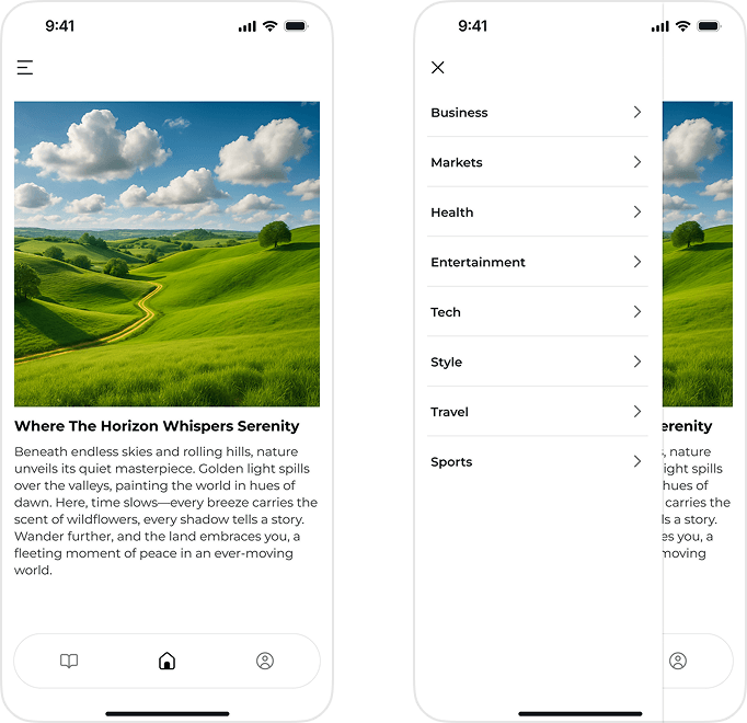
The main task here is to properly structure the menu elements and avoid excessive creativity in styling your hamburger menu button.

Avoid Disruption
Small screens imply a smaller space for creativity and additional elements. Through that, we highly recommend not overloading the interface with unnecessary forms, fields and buttons.
Mobile web design means that you must focus on key functionality first, while additional elements will be available, as the screen gets larger and the UI scales increase.
Trying to put too many content pieces on mobile will certainly overwhelm users and make them feel uncomfortable, which will negatively affect the final UX.

Always Test Hypothesis
Indeed, web design is a field where creativity is not in the last place, but in many cases trying to be special leads to unwilling consequences in clients losses and poor positioning.
You try to be special, to stand out from the competitors so hard that you come to false and harmful solutions. For example, you want to create a minimalist website, and your solution is to create a small homepage. Through that, you destroy its main purpose - to give as much info about your company as possible.
Trying to be special through methods like this will do nothing but make your website an unwanted place to visit (especially for mobile users). So, all the work done, has been done in vain.
That’s why testing hypotheses is crucial for business in large and for mobile web design in particular. So, we once again highly recommend applying to PoC or even MVP development, as both will allow to see technical, business and aesthetic strengths and weaknesses of the solution developed.
Conclusion
The shift to mobile dominance is undeniable, and businesses that fail to adapt risk losing valuable customers and market share. Through that, we say that mobile-first design isn’t just a trend — it’s a necessity in a world where smartphones are the primary gateway to digital experiences.
However, implementing a mobile-first approach requires lots of work to be done, including strategic planning, user-centric design and continuous optimization. From wireframing to real-device testing, every step must get simplicity, speed and usability in focus.
Start your mobile-first transformation today with Silk Data’s expert team and build experiences that users love, no matter the device.
Our Solutions
We work in various directions, providing a vast range of IT and AI services. Moreover, working on any task, we’re able to provide you with products of different complexity and elaboration, including proof of concept, minimum viable product, or full product development.


